
5 entries this week and the theme is freestyle so you don't have to consider whether or not the sig fits the theme as there isn't any theme. Same rules as before, no voting for yourself, no posting your pic somewhere else till the week's voting is over, no saying which is yours, no speculating as to which pic was made by who. Voting is public and try to remember to comment on why you voted for the sig you picked, it helps the artists get feedback.
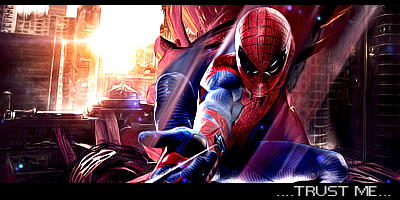
Entry 1:

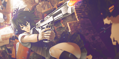
Entry 2:
Entry 3:

Entry 4:
Entry 5:

Entry 1:
Entry 2:
Entry 3:
Entry 4:
Entry 5:
