Graphics CnC (Comment and Critique)

DeletedUser

Guest
Hahaha..You do realize I'm not an evil person so technically I can't be mean. :p
 

DeletedUser

Guest
yes, Igor understands...Igor is sorry, ma...Igor is sorry.

Here is another image:


DeletedUser

Guest
@xtcmax Text it really cool,I like the light coming behind it
but spaceship and those 4 circular badges doesn't fit it.

Ps I don't know what your customer asked for,only telling what I think about it.


Don't know what went wrong in voting,just got two votes (neither complaining nor crying lol) but just curious to know what can be done to make this better :)

Also this was the original render on which I worked on (just attaching to prove that it was not copy pasta)

Render:

So CnC please

magicianlive.png
 
Last edited by a moderator:

DeletedUser

Guest
As I said in the thread, I think the b&w ruined it. I don't really know why but it just doesn't look that appealing, kinda... boring? Idk.
 

DeletedUser

Guest
Its a pretty good tag, I just have a few problems with it.

Could totally go without the text and pen tool shape, it doesn't do a whole lot for the piece at all.

Do a little more blending work. Your background is pretty good but your render stands out WAY too much. The slamming around of C4D's and vectors or whatever you use on the bottom doesn't help it blend a whole lot.

Create depth. I'm not good at this AT ALL and its a hard thing to master but trying to blur out the background and making parts of your render stand out from your background. I know it sounds conflicting when I tell you to make your render blend more but also to stand out. Basically what I'm trying to say is make the render as a whole blend but make key concepts pop; IE the face and in your case the hand.

One last thing. PLEASE use a render with flow. Don't get me wrong, what you have now is a great render but it doesn't have flow.

Sorry if I sounded mean, I totally don't mean to come off that way. I'm just trying to give you some friendly advice :)

CnC this please! Was made via request :)

man_made_of_iron_by_calebbutcher-d57r48e.png
 

DeletedUser

Guest
As I said in the thread, I think the b&w ruined it. I don't really know why but it just doesn't look that appealing, kinda... boring? Idk.
Thats exactly what I thought when I made that but since the theme was b&w therefore I had to apply a Gmap
Here is the original without gmap
magician.png
maybe we can remove skulls and a book since they suit it more in b&w

Could totally go without the text
I didn't knew who he was so I thought I can make it look like a news channel is broadcasting news about an evil magician but yeah it didn't suited it well.

One last thing. PLEASE use a render with flow. Don't get me wrong, what you have now is a great render but it doesn't have flow.
I admit the render choice wasn't great and since it didn't had any flow thats why I had to depend only on the ball in his hand.

Sorry if I sounded mean, I totally don't mean to come off that way. I'm just trying to give you some friendly advice :)
Thanks a ton for sharing your views about it :)

man_made_of_iron_by_calebbutcher-d57r48e.png


First and main thing is text,font selection is very poor.Its really hard to tell what you have written there,I think its 'the black Panther'.
Second thing,the light spot just below the text is looking bad,always try to keep only one light spot and in this case the one from his chest is looking natural and fine,there is no need to create another.
Also there is an unusual red brushing in right most part.
 

DeletedUser

Guest
1.Err what is this :heh:,the lightening is toooooooo bright and I am not able to see most things.
2.It looks like you have made this with paint and this look like a collage of butterflies, seriously dude stop playing with paint gimp is way better :D
3.There is nothing except 5 colors,a bright light and 5 butterflies,try to create atmosphere,something which looks natural.
4.This is not what that I will expect from someone like you :(
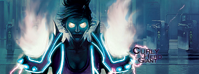
 

Varun

Strategos
1.Err what is this :heh:,the lightening is toooooooo bright and I am not able to see most things.
2.It looks like you have made this with paint and this look like a collage of butterflies, seriously dude stop playing with paint gimp is way better :D
3.There is nothing except 5 colors,a bright light and 5 butterflies,try to create atmosphere,something which looks natural.
4.This is not what that I will expect from someone like you :(

All points taken into account. :)

Seriously, hp, does it look like a paint job, cuz I created it on GIMP. LOL. :D (I'll keep in mind to distinguish the paint and Gimp jobs)
 

DeletedUser

Guest
Skullyhoofd:

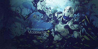
Overall this tag is good but i have a couple things to comment on. First, the background behind the render looks a bit too sharp, especially below the gun (maybe try smudging that corner thing a bit or really blurring it). Also, right above the render you can see a clipping mask/smudge dot thing that i would try to tone down a bit, i feel like it sticks out too much. Lastly, whether this was intentional or not, the gun seems to be a bit of a focal point since the fire is so orange compared to the rest of the tag. What my advice would be is to dull down the light in the upper left corner by the render's head and move the lighting towards the gun since it's more a focal point. These are just my thoughts however, so do as you wish.
 

DeletedUser

Guest
Umm this thing doesn't blend well,bg is really off I think it has a gmap on it if yes than remove it or lower the opacity.Fire also not looking good you need to work more on that also text color must be changed to make it readable.But yes cool render,few tweaks here and there and this would look fantastic.
 

DeletedUser

Guest
Ehm, you do realize than gmaps help blending, right? Without them the colours would even differ more. Also the fire was part of the render, sadly. I wish it wasn't there but I can't really delete apart f the render without him having huge chunks cut out of his shoulders :(

Thanks for the CnC! :D
 

DeletedUser

Guest
With pentooling like that, it works really well if you add a lot more depth with c4ds and even more pentooling, and then blur it all a lot more it looks better.
Needs more depth overall, and some more highlighting would look good, but not too bad.
 

DeletedUser

Guest
Ehm, you do realize than gmaps help blending, right? Without them the colours would even differ more. Also the fire was part of the render, sadly. I wish it wasn't there but I can't really delete apart f the render without him having huge chunks cut out of his shoulders :(

Thanks for the CnC! :D

yeah I know gmaps help in blending but while applying them 2 things must be kept in mind-
1.they should be applied on whole tag i.ie both bg and render not to one of them generally.
(I think here you have applied map only to bg)
2.In +90% cases their opacity must not be more than 25%.


With pentooling like that, it works really well if you add a lot more depth with c4ds and even more pentooling, and then blur it all a lot more it looks better.
Needs more depth overall, and some more highlighting would look good, but not too bad.

Good point,pentooling will look great here :)
 

DeletedUser

Guest
bumpy

liquid_by_skullyhoofd-d5eshsw.png


btw, I may not always say this, but I appreciate all the CnC from all of you! :D <3
 
Top