DeletedUser
Guest
Hahaha..You do realize I'm not an evil person so technically I can't be mean. 


Thats exactly what I thought when I made that but since the theme was b&w therefore I had to apply a GmapAs I said in the thread, I think the b&w ruined it. I don't really know why but it just doesn't look that appealing, kinda... boring? Idk.

I didn't knew who he was so I thought I can make it look like a news channel is broadcasting news about an evil magician but yeah it didn't suited it well.Could totally go without the text
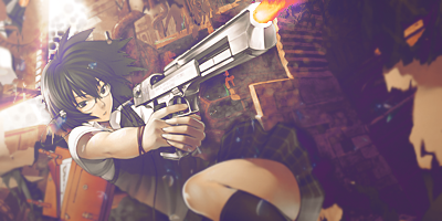
I admit the render choice wasn't great and since it didn't had any flow thats why I had to depend only on the ball in his hand.One last thing. PLEASE use a render with flow. Don't get me wrong, what you have now is a great render but it doesn't have flow.
Thanks a ton for sharing your views about itSorry if I sounded mean, I totally don't mean to come off that way. I'm just trying to give you some friendly advice
1.Err what is this :heh:,the lightening is toooooooo bright and I am not able to see most things.
2.It looks like you have made this with paint and this look like a collage of butterflies, seriously dude stop playing with paint gimp is way better
3.There is nothing except 5 colors,a bright light and 5 butterflies,try to create atmosphere,something which looks natural.
4.This is not what that I will expect from someone like you
(I'll keep in mind to distinguish the paint and Gimp jobs)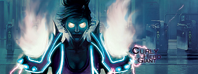
Ehm, you do realize than gmaps help blending, right? Without them the colours would even differ more. Also the fire was part of the render, sadly. I wish it wasn't there but I can't really delete apart f the render without him having huge chunks cut out of his shoulders
Thanks for the CnC!
With pentooling like that, it works really well if you add a lot more depth with c4ds and even more pentooling, and then blur it all a lot more it looks better.
Needs more depth overall, and some more highlighting would look good, but not too bad.
 <3
<3Tis good, well done.bumpy