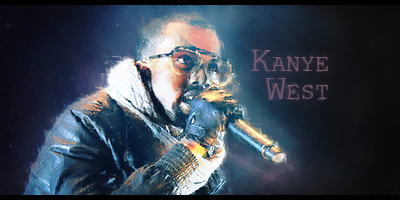
Here is another one I made recently. CnC?
Cheers,
Ben
P.s I know the background is a little empty, but I only wanted the render to be in this really...
Great work Ben

The smudging looks a bit weird to me...don't know if you want it that way. Way better than anything I could make
The smoke smudging is a bit off putting. I don't really know why but it just is.
Also the tenticle in the upper right is a bit out of place. I don't think you need it.
Overall good CoAs though
I think this is one of your best sigs!
Love the smoke
The only things I would change are there isn't really a color scheme in it.
Also that thing on the left side that is just black should be taken out
I am not really experienced with transparentcy but it's pretty good I guess.
The render doesn't really feel connected to the background, if you know what I mean
Great job both of you


