Graphics CnC (Comment and Critique)

DeletedUser

Guest
bumpy
liquid_by_skullyhoofd-d5eshsw.png

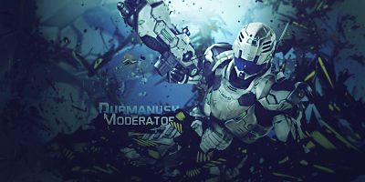
Much better that the previous but I must say this is bit darker in the edges,text need some focus too .
 

DeletedUser

Guest
my program said i spelled it right noooo i made a fool of myself on the interwebz
 

DeletedUser19042

Guest
lol...Well, it's spelled wrong. :D
But don't worry. Nobody saw it yet. ;)
 

DeletedUser

Guest
First version is poster style:


Second version is normal style:


Last edited by a moderator:

Varun

Strategos
First version is poster style:


Second version is normal style:


What can I say? Beautiful as usual. Here is my CnC

The colours are bright but extremely mellow. It has an extremely good effect on the eyes making it extremely appealing. Also, the space background and font face is good.
 
Top