New Layout Feedback Thread

DeletedUser27700

Guest
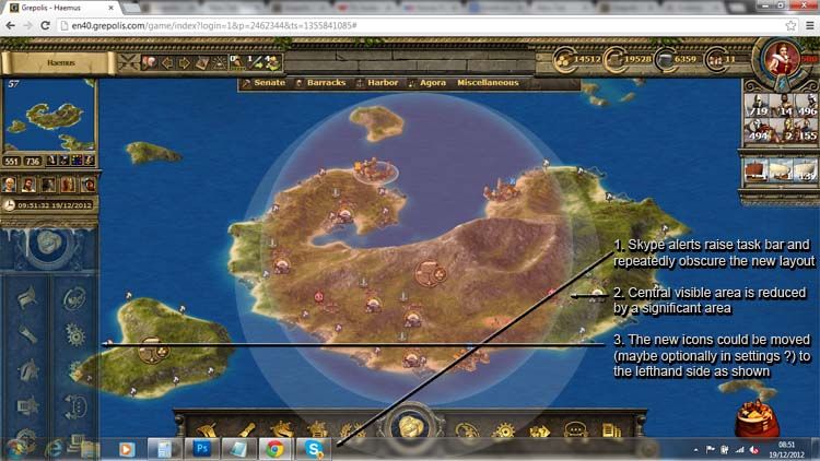
City Overview Button.... Where is this simple yet vital shortcut that once was? Also, I don't use premium, maybe in the future but not anytime soon, so I'm curious why there is a GIANT "Here Buy Gold" button in the middle of all this?

"COME ON, MAN!"

Look at the top of your screen. Now to the left. To the right of the flashing swords. There is a button, looks like a small building with a magnifying glass over it, click on it. That's your City Overview. I am pretty sure the tutorial shows this.
 

DeletedUser

Guest
I'm just going to repeat what's probably already been said. It makes life easier for me when I'm on my phone to a point. The attack/support/trade/etc window covers up the arrows for cycling between cities. Therefore I open the window, select my action, minimize the window, select my city, open the window etc... real pain. It's just too high on my phone.
 

DeletedUser23516

Guest
Its a step in the right direction. It just needs some tweaks. I'm not going to waste your time with things already said, but it defiantly needs change.
 

DeletedUser

Guest
I don't like the new menu layout. There is no "City Overview" tab in it. So, i prefer the old menu bar. And i couldn't find the reservation system. And there is glitch too. I can't close or minimize a tab(say, city overview) without clicking it twice or thrice. I think it could be a bug or just my computer. But I don't think it will work in my phone. So, do CHANGE IT. I don't mind the myth unit though.
 
Last edited by a moderator:

DeletedUser

Guest
The new menu bar is poorly designed ... it reduces the unobstructed vertical map size on a typical widescreen laptop display (1366x768) to c. 510 pixels (was c. 610 pixels), thats a 16% loss !

Having the icons on the left would still leave c. 1070 pixels map width (after deducting left and right panel widths), so much less impact.

So the choice is between old map area: 1070 x 610, or new map area 1070 x 510, a 16% loss is not something you get used to !

At least make the icon positioning optional through user Settings , as there are other drawbacks to the new position, eg. skype notifications cause task bar to pop-up over the menu bar ! Also, being unlabelled icons makes it slower to locate the function you want without first cursoring over the icon.
NewGrepolisLayout_zpsecdd3c1f.jpg


Even better would be to combine the current left and right panels on the right side, and have the new icons in one narrow vertical strip on the left side
 

DeletedUser

Guest
Hi Richard

It look good, but I cannot see the whole page, for some reasonthe page is not downloading everything, the same thing is happening on my android. I am ot sure if it is because of the uograde? The features show up and the tool and menu bars show up, but the island does not show up, the age is just black where the island should be. What do you recommend?

I use my phone alot to play this game also. There are two problems with it. None of the islands or the map show up only the city view. This makes it vary hard to do just about anything when playing on a 5 inch screen. Second, The new UI doesnt adjust sizes when you zoom and i can only see that bs "premium button" which then takes up my whole phone screen.
 

DeletedUser

Guest
I don't like the new menu layout. There is no "City Overview" tab in it. So, i prefer the old menu bar. And i couldn't find the reservation system. And there is glitch too. I can't close or minimize a tab(say, city overview) without clicking it twice or thrice. I think it could be a bug or just my computer. But I don't think it will work in my phone. So, do CHANGE IT. I don't mind the myth unit though.
Totally agree.

This new UI steals way too much screen real estate on a widescreen laptop and I'm also having to do multiple clicks within dialogue windows. I don't think that's a bug, I think it's something to do with the browser handling the toolbar at the foot of the screen as the first click seems to merely jump the whole display upwards slightly.

My vote is for the new toolbar to be moved to the left margin as per Leonidas Agiad's suggestion.

Can't believe the developers tested this on a typical laptop!
 

DeletedUser

Guest
Its particularly annoying when there are plenty of good suggestions for improving the game, and then some marketing idiot decides its a good idea to impose some dysfunctional GUI changes to try and raise revenue. I suspect this will backfire though, its such a poor use of screen-space and blatant attempt to extort even more money that it'll reduce peoples commitment to the game.

As a workaround, if you open the Reports, Messages, and forum windows, and then zoom out the map, the Menu bar disappears but leaves the open windows.
 

DeletedUser

Guest
lol agree with you there

on another note the reservation tool is now working
 

DeletedUser21425

Guest
lol agree with you there

on another note the reservation tool is now working

Yes, but what is this new reservation tool?

EDIT: ok, I've seen it. I've tried it.
At first glance it has pros and cons

negative:
1. There is no Ocean number (most people organize by ocean)
2. We all use lists of cities TO BE CLAIMED. That's not possible here, unless 1 player is assigned to claim every take over first, and then edit the reservation later for the real claimant. That one player is going to have a hell of a job.
3. where can I fix the settings for the expiration time? Most alliances allow 2 days for a claim, not 7.

positive:
1. a tool at last. If everybody is allowed to claim then there is no need for a claims adjudicator
2. no double claims anymore

first idea of use:
make a tab in forum with cities to be claimed
then put the claims in reservations
 
Last edited by a moderator:

DeletedUser

Guest
check out the announcement page at the top of the forum, Richard has explained it there
 

DeletedUser12324

Guest
I like the new layout, very smart and the new reservations tool is going to save me alot of work as claims moderator for the alliance i'm in. Don't know why you guys are hating on it...
 

DeletedUser21425

Guest
I like the new layout, very smart and the new reservations tool is going to save me alot of work as claims moderator for the alliance i'm in. Don't know why you guys are hating on it...

just stating pro and con. Depends on the alliance to use it most effectively.
listings of to be taken over cities can be in forum, or, as I said, claimed by 1 claim moderator. If every member can update the reservations with their own names, then it is a quick tool.

btw, I don't see where you can update or change a reservation atm. I think you have to delete a 'released for alliance' reservation first, then re-reserve for a player
 
Last edited by a moderator:

DeletedUser

Guest
Yes, but what is this new reservation tool?

EDIT: ok, I've seen it. I've tried it.
At first glance it has pros and cons

negative:
1. There is no Ocean number (most people organize by ocean)
2. We all use lists of cities TO BE CLAIMED. That's not possible here, unless 1 player is assigned to claim every take over first, and then edit the reservation later for the real claimant. That one player is going to have a hell of a job.
3. where can I fix the settings for the expiration time? Most alliances allow 2 days for a claim, not 7.

positive:
1. a tool at last. If everybody is allowed to claim then there is no need for a claims adjudicator
2. no double claims anymore

first idea of use:
make a tab in forum with cities to be claimed
then put the claims in reservations

neg #2 - this can be done by claiming for the alliance, city then shows as 'claimable' for everyone else. - Downside, it is cumbersome as it appears it has to be done one city at a time instead of marking all cities owned by a particular player.
Neg#3 - expiration time and number of allowed claimed can be edited by clicking 'reservation settings' in the lower right hand corner. I expect you have to have admin rights to change these, so if you don't you prob cant see the change link.
 

DeletedUser21425

Guest
Is it possible to share the reservations tool with another alliance?

yes: under reservation settings :)
 
Last edited by a moderator:

DeletedUser21425

Guest
okay, I've played a little.

- you can put in TO BE CLAIMED cities (release for alliance)
- a player can then claim it under tab NEW (don't know how it works with more then 1 player yet - does everyone have the right to claim?)
- you can share with other alliances
- you can remove a claiming player, you don't have to remove the entire claim

things are looking up.
 

DeletedUser

Guest
okay, I've played a little.

- you can put in TO BE CLAIMED cities (release for alliance)
- a player can then claim it under tab NEW (don't know how it works with more then 1 player yet - does everyone have the right to claim?)
- you can share with other alliances
- you can remove a claiming player, you don't have to remove the entire claim

things are looking up.

Yes, anyone in your alliance can reserve. But only he/she can edit their own claims...Unless they were given administrator rights by a leader.

~ Lane
 

DeletedUser

Guest
Lets not get to off topic this is thread is about getting feedback for the new layout. Not feedback for the reservation tool.
 

DeletedUser21425

Guest
Lets not get to off topic this is thread is about getting feedback for the new layout. Not feedback for the reservation tool.

o, I thought it was feedback on the update ... including the reservation tool.

but on the UI: never put a hugh toolbar at the bottom of the screen if your screen is landscape.
Put the same toolbar on the left and smaller. put in the keywords, so hovering is not necessary.
 
Top